
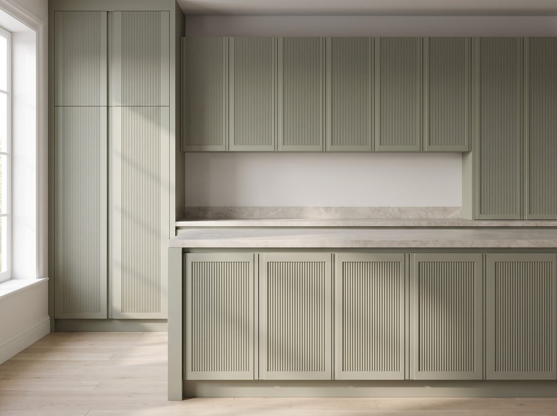
The island is where kitchens stopped being rooms and became furniture. Its doors deserve a different set of rules.
Texture belongs here
Fluted and reeded faces on an island catch light from every side and beg to be touched — the exact response a centrepiece exists to provoke. Wrap matching panels around all visible sides; an island with unfinished back is a cabinet caught undressed.
Colour-block logic
Island one to three shades deeper than perimeter is the reliable formula: grounded, practical (hides stool scuffs), photogenic. Same design both zones, or same colour two designs — change one variable, never both.
Practical details
Satin or matte over gloss at stool height; drawer stacks over doors for real storage; and panel-ready ends sized for seating overhang. Our Multi Country textures and Classic slabs are the two most-specced island families for a reason.