
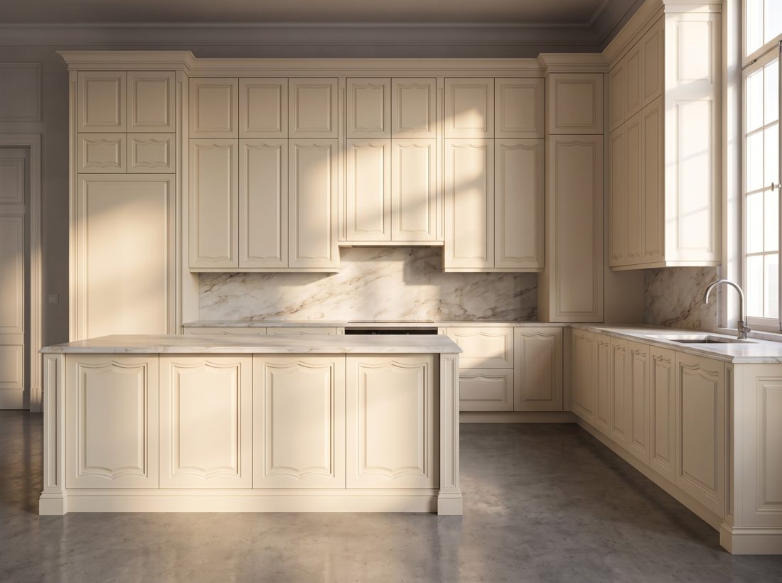
Powder blue delivers colour with the gentleness of a neutral — coastal without kitsch, nostalgic without pastiche. It loves morning light and marble.
The exact RAL codes to spec
Colour names drift between suppliers; RAL codes do not. These are the three we mix most for powder blue cabinet projects:
| RAL 5024 | Pastel Blue |
| RAL 2408010 | Soft Powder |
| RAL 5014 | Pigeon Blue |
Every code sprays in super-matte through high gloss; approve the sprayed sample in your room's light before production — sheen shifts colour a half-step.
What to pair it with
Powder Blue performs best beside polished nickel or brass, white marble, pale oak, warm white walls. Keep undertone temperature consistent across counters, metals and floors and the scheme locks together on its own.
Where it works best
Specify powder blue for coastal kitchens, kids' baths, laundries, cottage schemes. For dosing strategies — island-only colour, two-tone splits — see the two-tone formulas guide.
Door designs to carry it
The colour reads differently by profile: on our Azalea, Pearl, Boheme designs it shows its full range from calm to characterful. All are lacquered to order in any code above — browse the gallery for the complete set.
The mistake to avoid
Against stark white it can read babyish — partner with cream or greige instead of pure white.